Role
Tools/Skills
User Research, Accessibility, Design Systems
Team
Duration
Overview
TL;DR
Problem
Before UCLA Film TV archive releases the newest design, I wanted to validate its accessibility and usability,
What I did
Led on-site interviews and prototype testing, guided two designers, and refined the library’s shared toolkit.
Result
A more legible, easier-to-scan archive, plus 5 refined components and 30+ icons for the library-wide system.
Problem
Visitors struggled to read the site and find what they needed.
Many of the archive’s visitors are elderly cinema-goers. On the website, small type made content hard to read, and the navigation made screenings and archive resources hard to find.

Research
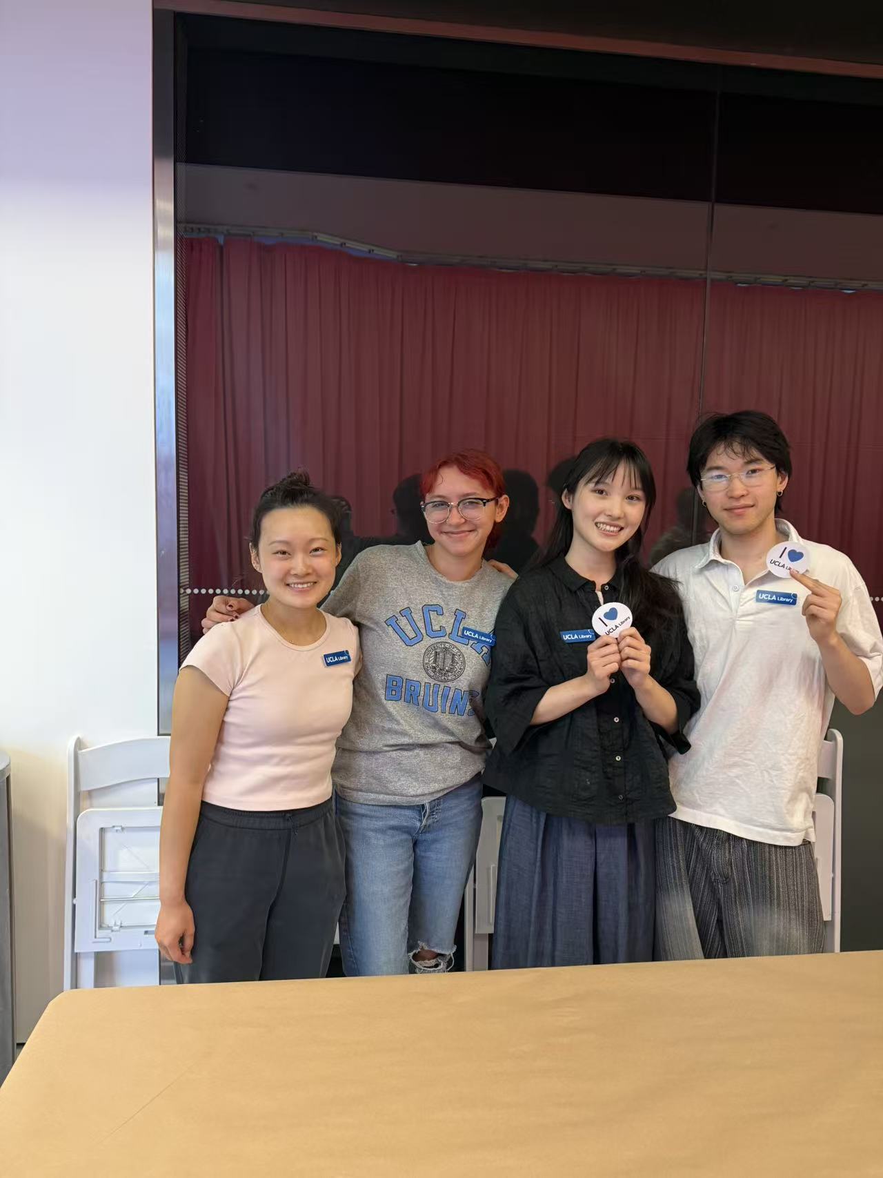
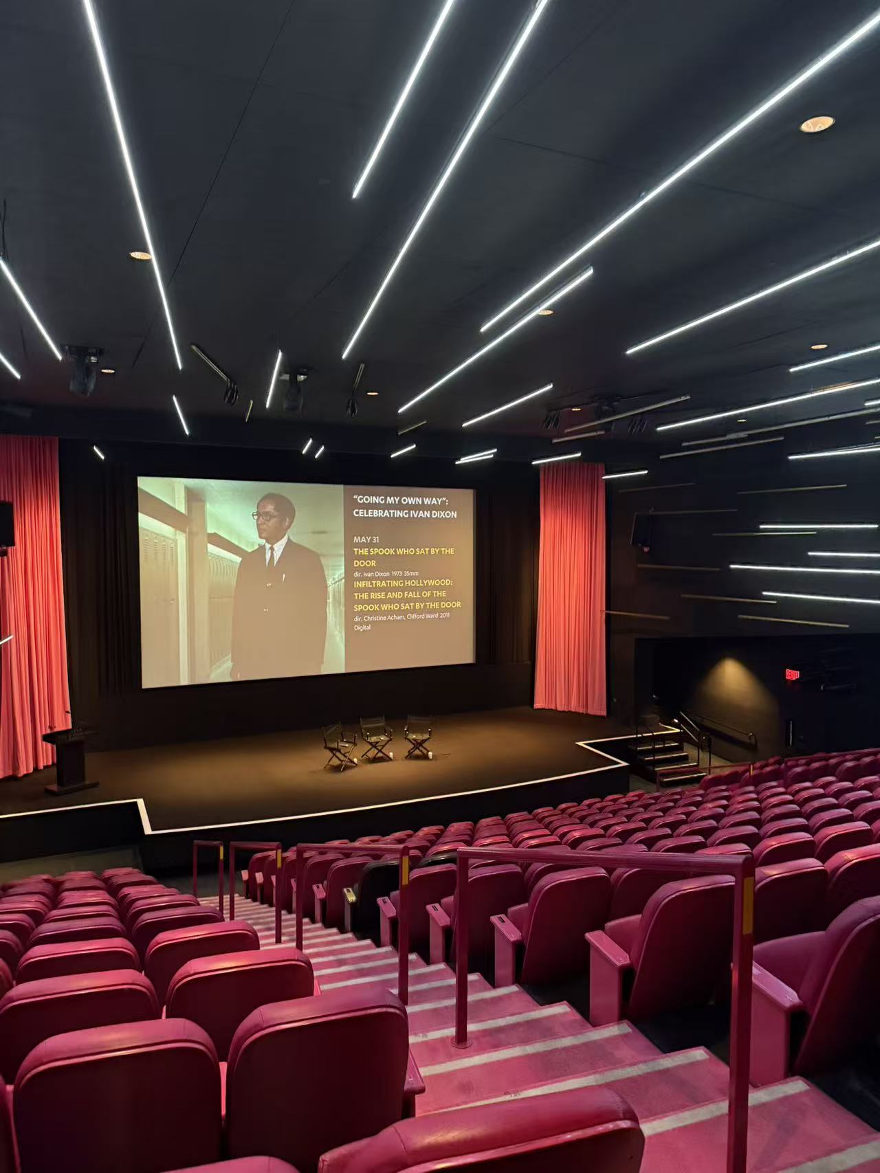
I went to the cinema to talk to visitors.
I planned and led on-site interviews with four older visitors, then ran high-fidelity prototype tests. Two problems came up.
01
The text was too hard to read.
Type sizes and styling weren’t legible enough for visitors who needed larger, clearer text.
02
Visitors couldn’t find what they came for.
The navigation and content structure didn’t match how visitors looked for screenings and archive resources.
Final Solution
Each finding became a design decision.
I guided two designers through the redesign and kept every change tied to what visitors told us.


Design System
A system for the library
I also refined UCLA Library’s shared design toolkit, building components and icons that keep every library site consistent.

I made 40+ custom icons in Figma for the library-wide toolkit which is live on current site
Impact
Measurable Impact
My research led to clearer type and navigation on the archive site, and my 5 components and 30+ icons became part of UCLA Library’s shared toolkit.
Reflection
Always test with real users!
Working in Higher Education means that design should start with structural clarity, not just visual. Leading usability testing showed me how refining information architecture can significantly improve discoverability.